
Lunch & Learn: Using Typography Well
Welcome to our new Lunch & Learn blog series! Once a month, someone at Reliant Studios presents on a topic of their choice to the rest of our team. This series of blog posts will be a compilation of what we've covered in each of these gatherings. Take this journey with us, as we continue to learn from one another!
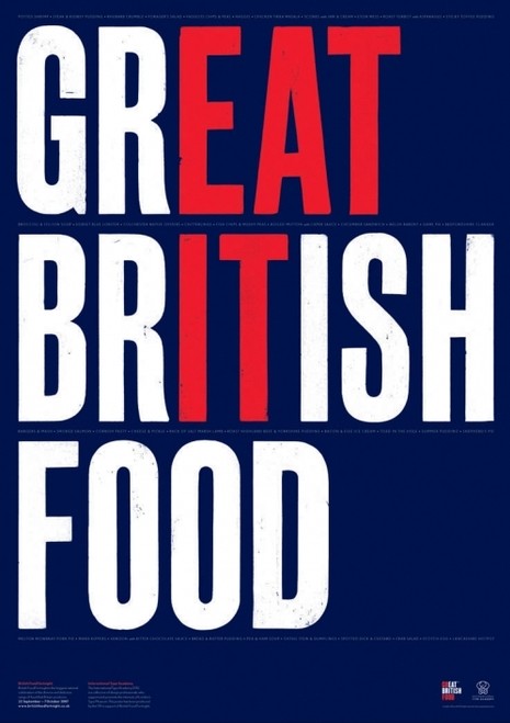
There’s more to typography than meets the eye. Typography is the art of arranging type in order to make language visible. That means that whether you’re reading a street sign or a menu, a movie poster or a blog post - if you can read, typography impacts you on a daily basis.
Perhaps you’ve never strayed outside of Times New Roman or Arial, or maybe you’re even a comic sans criminal. If that’s the case, it might surprise you to know that there are over 150,000 fonts on fonts.com, and that number continues to grow daily. There are large communities all over the internet of self-proclaimed “font geeks” who are dedicated to mastering an art that has no rules, just guidelines.
Typography can be tricky for a video editor. The goal of video is to tell stories with the camera, and type is most often used in video to fill in gaps in a story, or for quick information, such as a person’s name and title. Less is usually more, so it’s easy for type to become an afterthought.
But at Reliant, we desire excellence in every aspect of our work. That includes typography. While a graphic designer might need to know more about type than a video editor, to say that typography is somehow of less value to video is incorrect.
We’ve all seen type done wrong. Maybe it’s a billboard plastered with way too many words to read as you pass by, or maybe a graphic at the end of a local commercial that uses multiple fonts in 7 different colors. It’s not that we’re unable to read these things, it’s that we don’t want to read these things. And maybe we do read these things only to find there’s a giant disconnect between the typography and the brand. Good typography uses strategy and asks questions:
What’s the message beyond the words?
Who will read this?
How long will they have to read it?
It’s worth asking these questions because good design uses good typography.
This is barely the tip of the iceberg. As is true with lighting, sound, editing, etc., typography is an entire artform in and of itself. At Reliant Studios, we have all the tools we need to be great with type. Even though we may never quite fit in with the “font geeks,” we can still develop enough expertise to use typography in ways that enhance the stories we tell through our videos. Great video is a combination of a bunch of little things done right, and typography is just as important as anything other element. We refuse to overlook it.